The descriptions below are a brief overview of the topic. Go through the recommended resources to get in-depth explanations of CSS Grid.
Introduction
A grid is a framework of spaced bars that are parallel to or cross each other or a network of lines that cross each other to form a series of squares or rectangles.
What is CSS Grid?
CSS Grid layout or CSS grid is a technique in CSS that allows web developers to create complex responsive web design layouts more easily and consistently across browsers. CSS Grid Layout Module offers a grid-based layout system, with rows and columns, making it easier to design web pages without having to use floats and positioning.
CSS Grid Layout is the most powerful layout system available in CSS. It is a two-dimensional system, meaning it can handle both columns and rows, unlike CSS Flexbox which is largely a one-dimensional system. CSS Grid Layout excels at dividing a page into major regions or defining the relationship in terms of size, position, and layer, between parts of a control built from HTML primitives. Like tables, grid layout enables an author to align elements into columns and rows. However, many more layouts are either possible or easier with CSS grid than they were with tables.
I have completed 30 days in the 100 Days of Code Challenge. Below is a recap of everything I accomplished during this third chapter.
Projects
The majority of my coding for this chapter was for two main projects.
Image Gallery Layout

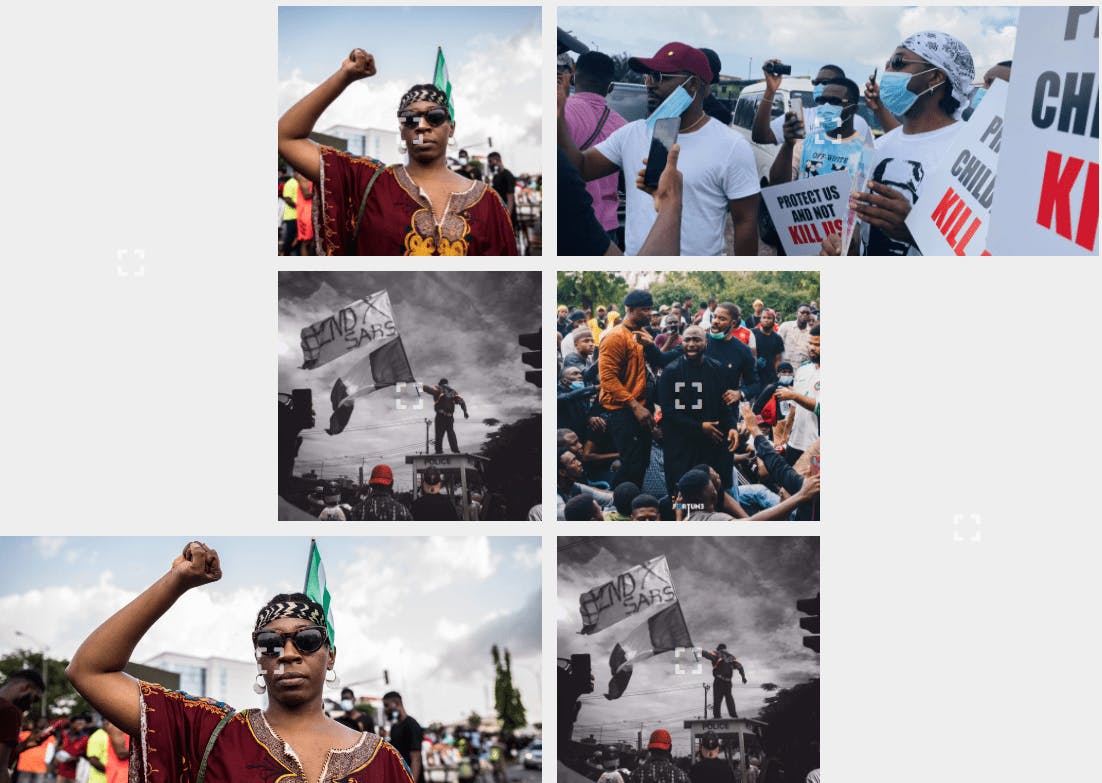
For this project, I created a responsive layout for an image gallery using CSS Grid. I used the display grid properties following with the grid-template-rows and column, grid-gap, and grid-template-areas to create the image gallery layout. I also added some hover effects to the image. I used the expand icon which is placed on the image from font awesome. So once you click on the expand icon, it opens the image on a new tab. You can check out this project on CodePen and GitHub.
Health Dashboard Layout

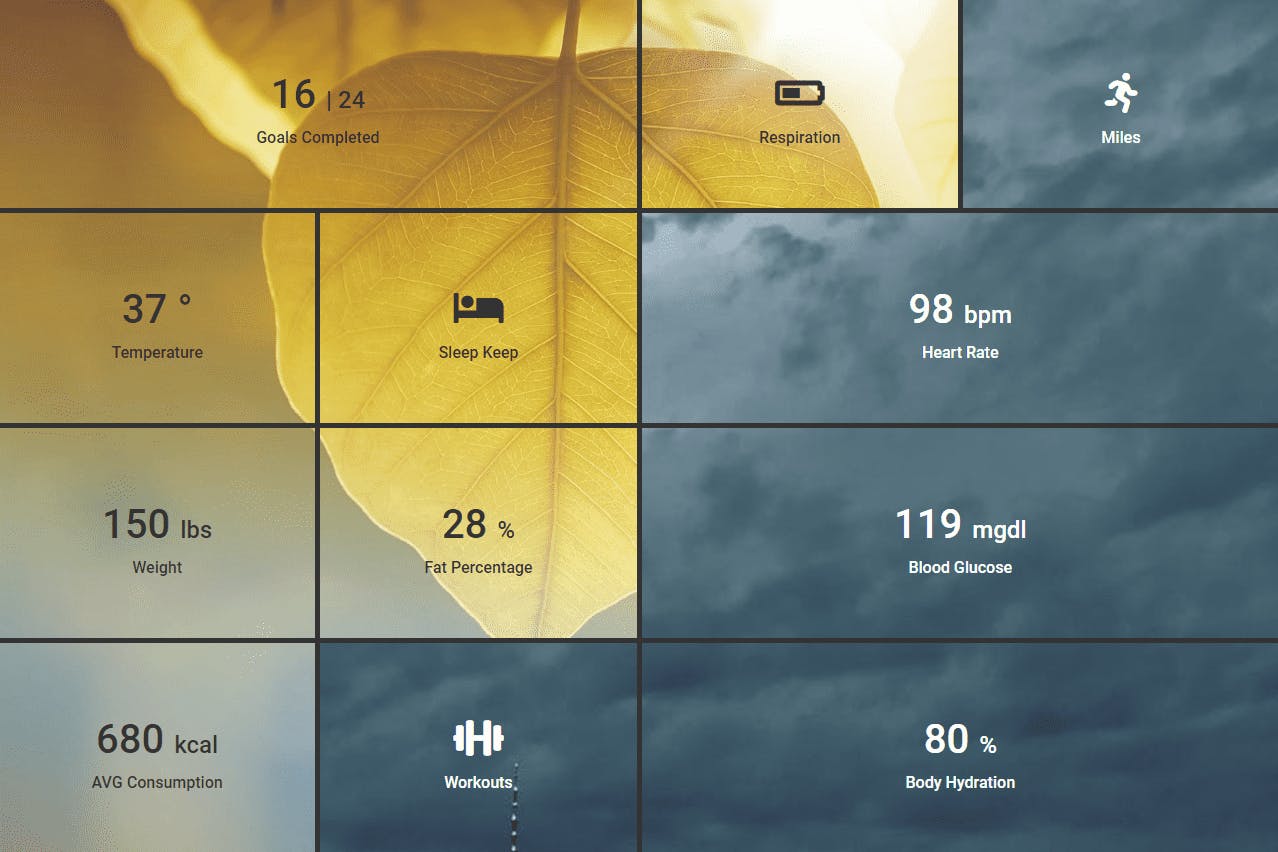
For this project, I created a health panel layout using CSS Grid. I did span a single image across multiple elements. I used two separate images and specific grid items using part of the images as a background. The trick to this project is setting the background-attachment property to fixed which allows you to expand the background to the viewport size and displays in every element.. As you might expect, you can also find this project on CodePen and GitHub.
Recommended Resources
• CSS-Tricks — A Complete Guide to Grid
• CSS Reference Concept — Grid
• Smashing Magazine — Best Practices with CSS Grid Layout
• Jen Simmons’s Layout Land — Videos on CSS Grid
What’s Next?
My plans for the next chapter are:
• Working on CSS Animation and building projects on them.
• Continue learning JavaScript.
Conclusion
I am writing this post to help other beginners like myself understand this topic better. I hope you enjoyed this post and that reading it provided some useful information.
I have only been coding for a few months now, so there is still a lot for me to learn. I would love it if you could give me any feedback on my projects.
Also, if you know any other recommended resources not mentioned on the list and you want to share, please feel free to drop the link in the comment section.
To see my daily progress on the #100DaysofCode challenge, follow me on Twitter @lanre__waju
