The descriptions above are a brief overview of the topic. Go through the recommended resources to get in-depth explanations of CSS Flexbox.
Introduction
Flexbox is short for Flexible Box Module. The Flexbox Module was designed as a one-dimensional layout model. It makes it easier to design flexible responsive layout structures without using floats or positioning.
What is CSS Flexbox?
CSS Flexbox also known as the flexible box is a type of layout model in CSS that makes it super easy to design responsive layouts. It is a web layout model that helps in designing a flexible layout. It allows items inside a container to be aligned automatically according to the screen size.
The flexbox module is a one-dimensional layout that provides an efficient way to align, layout, and distribute space among elements within your document even in a case of dynamic viewpoint or size. Flexbox as a one-dimensional layout refers to the fact that flexbox deals with the layout in one dimension at a time either as a row or column.
I have completed 20 days in the 100 Days of Code Challenge. Below is a recap of everything I accomplished during this second chapter.
Projects
The majority of my coding for this chapter was for two main projects.
Navigation Bar

For this project, I created the navigation links in the navigation bar using an unordered list which I believe is a common practice in creating a navigation bar and also for styling I used the display flex properties which is the first thing to do in using flexbox, then I evenly spaced and centered the links. You can check out this project on CodePen and GitHub.
Flexbox Pricing Table

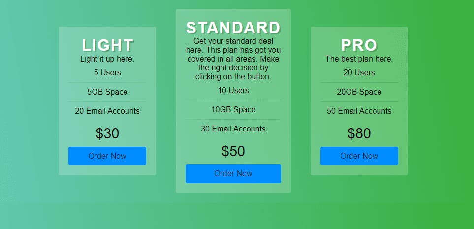
For this project, I turned on flexbox by using the display flex properties which is again very important in using flexbox, used flexbox nesting, and centered the three pricing tables. As you might expect, you can also find this project on CodePen and GitHub.
Recommended Resources
· CSS-Tricks – A Complete Guide to Flexbox
· Wes Bos – What The Flexbox?!
· A Visual Guide to CSS3 Flexbox Properties
· freeCodeCamp – How Flexbox Works
· CSS Reference Concept – Flexbox
What’s Next?
My plans for the next chapter are:
• Working on CSS Grid and building projects on them.
• Continue learning JavaScript.
Conclusion
I am writing this post to help other beginners like myself understand this topic better. I hope you enjoyed this post and that reading it provided some useful information.
I have only been coding for a few months now, so there is still a lot for me to learn. I would love it if you could give me any feedback on my projects.
Also, if you know any other recommended resources not mentioned on the list and you want to share, please feel free to drop the link in the comment section.
To see my daily progress on the #100DaysofCode challenge, follow me on Twitter @lanre__waju
